
Squonk Viz Intro

Tim Dudgeon 2026-09-18
POST
This post describes an important new application that is available in Squonk - Squonk visualisations or Squonk Viz for short. These allow you to assemble a range of powerful data visualisation techniques and apply these to the data you have generated using Squonk jobs or notebooks.
Squonk already had the concept of applications - some medium or long term running process that allowed you to do useful things. The first example was Jupyter Lab, allowing you to run Jupyter notebooks providing full access to your Squonk project’s data. Squonk Viz follows exactly the same approach - you fire up a Squonk Viz instance that has access to that same project’s data and in that instance you can build powerful visualisations out of the available components that allow you to analyse that data.
There is already a wide range of components that fall into three categories:
- data components - components for parsing data files, joining datasets and calculating derived values
- visual components - a range of common charting components such as scatter plots, histograms, box plots and many more
- molecular components - molecular display and analysis components (2D and 3D) and analysis tools e.g. R-group tables, ligand interaction diagrams and more
A full description of the components is available in the user guide and these can be seen in action in the component gallery.
Key to using Squonk Viz is the ability to define the behaviour when you interact with a data component. Take a simple example - a visualisation where selection in a scatter plot drives what is seen in a histogram. In design mode you wire up the components as desired:
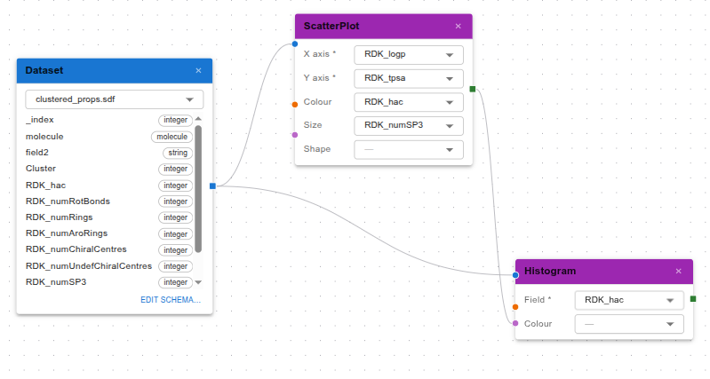
The blue dataset component allows you to specify the data file from your project that you want to handle, in this case an SD-file with a number of calculated or predicted properties. That data is fed to the purple scatter plot and histogram components which are configured with the appropriate fields (e.g. the scatter plot plots LogP vs. TPSA, colours the points by the heavy atom count and sizes them by the number of SP3 carbons).
Once you have completed the design of your visualisation you can switch to view mode where you can explore your data. Importantly what you select in a visual component is available as an output of that component and the Selection output of the scatter plot is wired to the Marking input of the histogram, so that the points that you have selected are highlighted in the histogram:
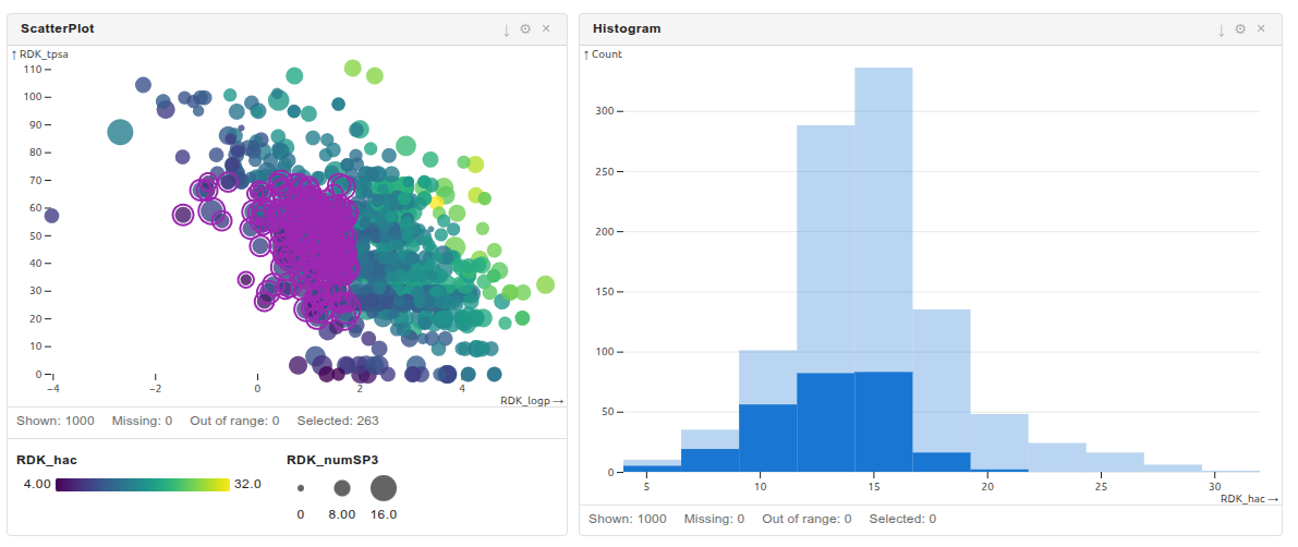
Alternatively, you can use the selection to filter the display of the histogram. Just wire the selection to the Filter input of the histogram.
Basically, in conceptual terms that’s all there is to it. But with a wide range of components you can create some very powerful visualisations. For instance, here is one letting you explore poses of ligands from a docking run. The ligand-protein interactions can be seen and filtered in the LigandInteractionMap component. Those selected there are illustrated in cartoon form in the LigandInteractionDiagram and the MoleculeViewer3D components, and the ligand in focus in the interaction diagram is highlighted in the 3D viewer.
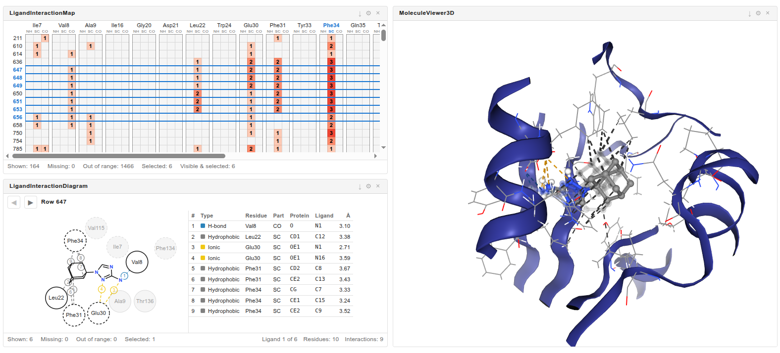
Powerful stuff, but all based on a very simple paradigm.
You can access Squonk here.
latest posts
by year
2026
2024
2023
2021
2020
Fragment Network REST API Cookie-cutting Ansible Kubernetes Projects Deploying container images from a private GitLab registry Fragment network basics Fragment network intro Redirecting to www with an nginx ingress Installing Kubernetes with Pharos Virtual screening for SARS-Cov-2 main protease inhibitors
2019
2018
by category
Blog
Containers
Software design
Automation
AWS ParallelCluster v3 Custom Images Migrating to AWS ParallelCluster v3 Kubernetes object linting with popeye GitHub Actions for container images Cookie-cutting Ansible Kubernetes Projects Installing Kubernetes with Pharos Building machine images with Packer Python and the Jenkins API Applying the build process to the deployment
IaC
Docking
Fragment network
Kubernetes
Kubernetes PreStop Lifecycle Hooks A kubernetes volume replicator Fixing a broken etcd cluster Kubernetes object linting with popeye Cookie-cutting Ansible Kubernetes Projects Deploying container images from a private GitLab registry Redirecting to www with an nginx ingress Installing Kubernetes with Pharos
Web
Ansible
Python
Squonk